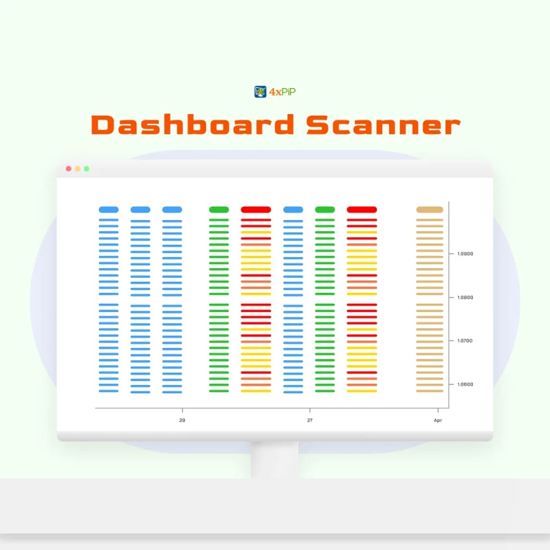
In the vast landscape of data representation, the humble bar graph stands as a powerful and widely used tool. Its simplicity belies its effectiveness in conveying complex information visually. As we delve into the realm of bar graphs, brought to you by 4xPip, a trusted resource for trading tools and expertise (reach out to their experts at [email protected], we’ll explore the intricacies of understanding bar graphs, their properties, various types, limitations, and the benefits they offer.
Understanding Bar Graphs:
At its core, a bar graph is like a visual storyteller for data, using the language of bars to share information in a way that’s easy to understand. Imagine you have a set of data, like the sales figures for different months. Now, picture a graph with a line running up and down (that’s the y-axis) and another line stretching left to right (that’s the x-axis). These lines create a grid, turning your data into a series of bars.
Now, each bar in this graph represents a different piece of information; say, the sales for each month. Additionally, the height of the bar corresponds to the value of that information. So, if March had higher sales, its bar would be taller. Furthermore, this visual representation helps us see, at a glance, which months performed better or worse. Moreover, it’s like turning raw numbers into a visual story where you can quickly spot trends, highs, and lows.
The y-axis, often on the left or right side of the graph, is like the scale of our story. It tells us how much—whether it’s sales, quantities, or any other data. On the other hand, the x-axis at the bottom is like the timeline or categories. It gives context to our story, placing each piece of information in a specific spot. So, when we talk about understanding bar graphs, we’re really talking about deciphering this visual language of height, axis, and categories to reveal the narrative hidden in our data. It’s like reading a chart that tells a story about numbers, making data come alive in a way that’s accessible to everyone.
Types of Bar Graphs:
- Vertical Bar Graph:
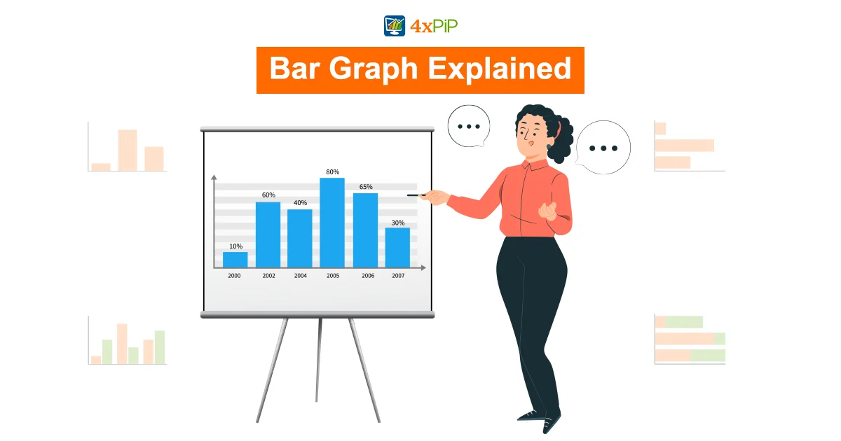
The vertical bar graph is a classic choice where data is displayed with rectangular bars extending vertically. Each bar starts from the bottom x-axis, and the height represents the value. This type is commonly used in financial analysis, such as volume charts in trading. It provides a clear representation of how values compare within a specific category.
- Horizontal Bar Graph:
In contrast to the vertical counterpart, the horizontal bar graph displays data with bars extending horizontally from the side y-axis. The length of each bar signifies the value, offering an alternative perspective for data comparison. This orientation is particularly useful when dealing with categorical variables and allows for a different analytical approach.
- Grouped Bar Graph:
Grouped bar graphs, also known as clustered bar graphs, are employed to represent discrete values for more than one item within the same category. Bars are grouped together, breaking down the overall value for a comprehensive comparative analysis. This type allows for the simultaneous examination of multiple categories, each with its set of separate bars.
- Stacked Bar Graph:
Stacked bar graphs, also referred to as composite bar graphs, divide a total into parts. Each part is identified by different colors within the same rectangular bar. This type is effective in showcasing various components of a whole, providing a visual breakdown of the total value. Stacked bar graphs can be depicted both vertically and horizontally, offering flexibility in data representation.
Understanding these types equips data analysts and decision-makers with versatile tools to choose the most appropriate format based on the nature of the data and the insights sought. Whether it’s comparing individual items within a category or visualizing the composition of a total, selecting the right type of bar graph enhances the effectiveness of data representation.
Mastering Data Storytelling with Bar Graphs:
Beyond their role as data visualization tools, bar graphs can serve as powerful instruments for storytelling. This blog will delve into the art of using bar graphs to narrate compelling stories with data. Whether you’re presenting to stakeholders, colleagues, or the general public, mastering data storytelling with bar graphs can elevate your communication skills and make your insights more impactful.
The Narrative Power of Bar Graphs:
Establishing a Clear Narrative:
A well-constructed bar graph should tell a story. It should guide the audience through a narrative, helping them understand the context, identify trends, and draw meaningful conclusions.
Implementation: Start by framing your data in a way that introduces a problem, development, or comparison. Use the bar graph to unfold the narrative, making key points visually apparent.
Highlighting Trends and Patterns:
Bar graphs are excellent tools for highlighting trends and patterns in data. Whether it’s an upward trajectory, a sudden drop, or a comparison over time, the graph should emphasize these key elements.
Implementation: Employ color, annotations, or emphasis techniques to draw attention to critical points on the graph. Clearly articulate the significance of these trends within the context of your narrative.
Adding Contextual Details:
Context is crucial for a comprehensive understanding of data. Bar graphs can be enriched with contextual details, providing a deeper layer to the story.
Implementation: Include relevant background information, reference lines, or annotations to provide context for the data. Help your audience connect the dots between the numbers and the real-world scenarios they represent.
Creating Compelling Comparisons:
Bar graphs excel at showcasing comparisons between different categories or groups. A well-designed comparison can strengthen the narrative and make the data more relatable.
Implementation: Utilize grouped or stacked bar graphs to facilitate side-by-side comparisons. Clearly label the categories and use color strategically to enhance the visual impact of the comparisons.
Guiding the Audience’s Focus:
Effective storytelling involves guiding the audience’s attention to key insights. Bar graphs can be used to direct focus and emphasize the most critical aspects of the data.
Implementation: Experiment with variations in bar colors, sizes, or annotations to highlight specific bars or sections. Use visual cues to guide the audience’s eyes through the narrative.
Invoking Emotional Engagement:
Humanizing data can evoke emotional engagement and make your story more memorable. Bar graphs can be designed to resonate with your audience on a personal level.
Implementation: Incorporate personal stories, testimonials, or relatable examples alongside the bar graph. Use visuals and narratives that connect with the audience’s experiences.
Ensuring Accessibility and Clarity:
A clear and accessible visualization is essential for effective storytelling. Bar graphs should be designed with the audience in mind, ensuring that everyone can follow the narrative.
Implementation: Use straightforward language in titles and labels. Ensure that color choices are accessible to individuals with color vision deficiencies. Provide a concise but informative legend for the graph.
Bar Graph Properties:
Visual Language of Data: At its core, a bar graph is a visual language for data. It utilizes the height or length of bars to represent values, transforming numerical information into an intuitive visual format. This visual language transcends barriers, making complex data accessible to a wide audience.
Axes as Guides: The two critical components of a bar graph are the x-axis and the y-axis. The x-axis, positioned at the bottom, acts as a guide for variables like time or categories. The y-axis, either on the left or right, is the guide for values. These axes provide a structured framework, turning abstract numbers into a meaningful representation.
Height Indicates Value: The height of each bar is not arbitrary; it directly corresponds to the value it represents. This proportionality allows for a quick assessment of the magnitude of each data point. Higher bars signify larger values, creating an instant visual hierarchy.
Comparative Analysis: Bar graphs excel at comparative analysis. Whether comparing sales figures over months or assessing the performance of different products, the side-by-side or stacked arrangement of bars enables a swift and accurate comparison. This feature makes them invaluable for decision-making processes.
Categorical Representation: Beyond numerical values, bar graphs adeptly represent categories. Each bar can signify a category, allowing for a dual-layered presentation of information. This versatility enables the simultaneous visualization of both categorical and numerical data.
Interpreting Patterns: A skillful examination of a bar graph can unveil patterns over time or across categories. Trends, spikes, or declines become evident, providing valuable insights for informed decision-making. It’s not just about individual bars; it’s about the narrative woven through their collective representation.
Universal Applicability: Bar graphs transcend industries and fields. From financial reports to educational assessments, from market trends to survey results, the adaptability of bar graphs makes them a universal tool. Their simplicity and effectiveness make them accessible to professionals, students, and enthusiasts alike.
Effective Communication: A well-constructed bar graph is more than a data display; it is a form of communication. It efficiently conveys the main points of a dataset, eliminating the need for extensive textual explanations. This communicative power streamlines the exchange of information in diverse contexts.
Understanding bar graphs involves recognizing them as more than static visualizations. They are dynamic tools capable of narrating stories hidden within datasets, facilitating comprehension, and empowering decision-makers with actionable insights.
Limitations:
While bar graphs are powerful tools for data representation, it’s crucial to acknowledge their limitations to ensure accurate interpretation. One notable constraint lies in the impact of scale selection. If the scale chosen for the graph is inappropriate, it can significantly affect how the data is perceived. For instance, an overly large scale might make data appear insignificant when, in reality, it holds relevance. On the flip side, an undersized scale might exaggerate the importance of certain data points, leading to a distorted understanding. The scale chosen, therefore, plays a pivotal role in the meaningful comparison of data.
Another limitation involves the potential lack of substance in aesthetically compelling data. It’s common to encounter visually appealing graphs that, upon closer examination, lack substantial information. For example, examining only a few days’ worth of volume data in the stock market may not provide sufficient context for meaningful analysis. To extract valuable insights, it’s crucial to compare data over more extended periods, allowing for a comprehensive understanding of trends and patterns. This limitation emphasizes the importance of not solely relying on the visual appeal of a graph but delving deeper into the context it represents.
Interpretation dependency is a significant challenge in utilizing bar graphs. Additionally, the way data is chosen and displayed can heavily influence its perceived significance. For instance, highlighting specific data points while omitting others may skew the narrative. This interpretational vulnerability underscores the importance of transparent and unbiased data presentation. A comprehensive understanding of the context and the factors influencing data selection is essential for mitigating this limitation. Moreover, while bar graphs are powerful, their effectiveness hinges on careful consideration of these limitations in data representation and interpretation.
Mistakes to Avoid in Bar Graph Design:
Bar graphs are powerful tools for visualizing data, but creating effective visualizations requires careful attention to detail. Here are some common mistakes to avoid when designing bar graphs to ensure accuracy, clarity, and impactful communication of data:
Misleading Scales:
Mistake: Manipulating the scale on the y-axis can lead to misinterpretation. Stretching or compressing the scale can exaggerate differences or make them appear negligible.
Solution: Maintain a consistent and appropriate scale that accurately represents the data. Clearly label the axes to provide context for readers.
Inappropriate Bar Widths:
Mistake: Bars that are too wide or too narrow can distort the visual representation of data. Incorrect bar widths may mislead readers about the magnitude of differences between values.
Solution: Choose a bar width that allows for clear differentiation between bars while accurately representing the values. Experiment with different widths to find the optimal balance.
Using 3D Effects Unnecessarily:
Mistake: Adding unnecessary 3D effects to bars might make the graph visually appealing, but it can distort the actual data representation and make accurate comparisons challenging.
Solution: Opt for a clean and two-dimensional representation for most scenarios. Reserve 3D effects for cases where they genuinely enhance comprehension without distorting the data.
Incomplete or Misleading Labels:
Mistake: Inadequate labeling or unclear axis titles can leave readers confused about what the bar graph represents, leading to misinterpretation.
Solution: Ensure that each axis is clearly labeled with units if applicable. Provide a meaningful title for the graph to convey the purpose and context of the data.
By avoiding these common mistakes, you can create bar graphs that effectively convey information, facilitate accurate interpretation, and enhance the overall impact of your data visualizations. Remember, the goal is not just to make the graph visually appealing but to provide a clear and accurate representation of the underlying data.
Benefits of Bar Graphs:
Ease of Understanding:
Bar graphs serve as powerful tools for simplifying complex data; additionally, they make it easily understandable for a diverse audience. The visual representation of categories on one axis and, moreover, corresponding values on the other creates an intuitive relationship. This simplicity facilitates quick comprehension, allowing individuals, whether seasoned analysts or casual observers, to grasp the main points without delving into intricate numerical details.
Effective Data Comparison:
One of the primary advantages of bar graphs lies in their ability to efficiently compare different sets of data. Additionally, by presenting categories side by side or in a stacked format, users can discern patterns, trends, or disparities at a glance. This comparative analysis is particularly beneficial when dealing with variables such as sales figures; moreover, it is useful for survey results or any dataset with multiple elements. Bar graphs provide a clear visual hierarchy, aiding in the identification of dominant and lagging values.
Dynamic Illustration of Changes Over Time:
Bar graphs are adept at illustrating changes in data over specified periods; additionally, they offer a dynamic visual representation. Whether tracking monthly sales, quarterly performance, or annual survey responses, the bars allow viewers to identify fluctuations and trends easily. Moreover, this temporal dimension adds a layer of context to the data, enabling more informed decision-making. Furthermore, the ability to showcase data evolution enhances the communicative power of bar graphs, making them invaluable in conveying the narrative of progression or regression over time.
Summary:
This blog decodes the visual language of bar graphs, exploring their properties, types (vertical, horizontal, grouped, stacked), limitations, and benefits. Additionally, it emphasizes their unmatched advantages—simplicity, comparative efficiency, and dynamic temporal representation. Dive in for a comprehensive understanding of bar graphs and their multifaceted utility. Moreover, it discusses alternative uses and suggests overcoming limitations. Although they have constraints, the blog demonstrates effective utilization and provides insights into alternative visualization methods.